The Psychology of Color in Social Media Design: How Hues Drive Engagement
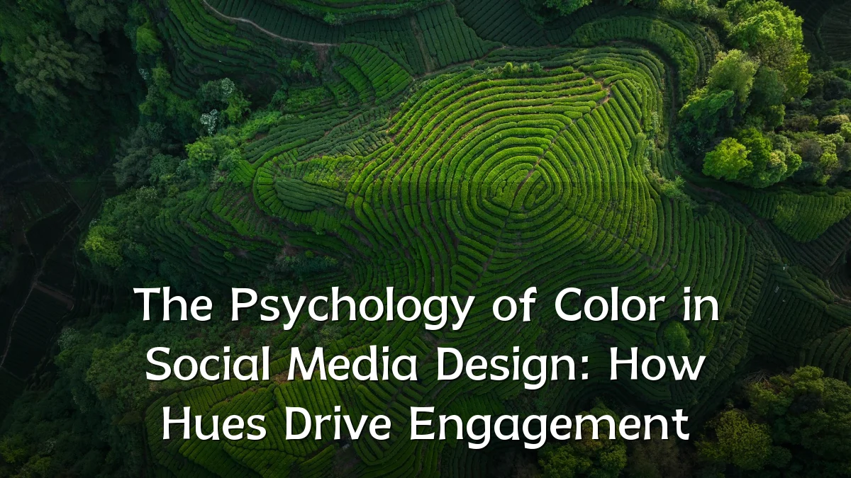
Across platforms, the choice of color palette has moved from a secondary aesthetic consideration to a central strategic lever. As brands compete for milliseconds of user attention, the relationship between specific hues and measurable engagement metrics is drawing renewed scrutiny from designers and product teams alike.
Recent Trends
Several observable shifts have emerged in how visual social media design approaches color:

- A move toward high-saturation accent palettes that stand out against platform-native white or dark mode interfaces.
- Increased use of gradient overlays and duotone treatments in static imagery, particularly for call-to-action elements.
- Growing adoption of "mood-driven" color rotation, where brands adjust primary hues based on campaign emotional tone rather than a fixed identity.
- Platform-specific adaptation: what performs well on a video-first feed (high contrast, warm tones) often differs from a text-heavy community board (cooler, softer backgrounds).
Background
The foundational principle stems from decades of behavioral research: color influences emotional response, memory retention, and perceived credibility. In a social media context, these effects are compressed into split-second judgments as users scroll. Warm hues—reds, oranges, yellows—have long been associated with urgency, appetite, and excitement, making them common in limited-time offers or reaction prompts. Cooler tones—blues, greens, purples—tend to signal trust, calmness, and professionalism, which explains their prevalence in financial services, health content, and corporate thought leadership posts. The challenge is that cultural context and individual experience can override these generalizations; no single color guarantees a fixed reaction across all audiences.
User Concerns
As brands deploy color psychology more intentionally, several user-side concerns have surfaced:
- Fatigue from overly aggressive, high-contrast palettes that prioritize algorithmic stop-scroll metrics over visual comfort.
- Accessibility gaps: low-contrast text or color-only indicators can exclude users with visual impairments or color vision deficiencies.
- Perception of manipulation: when color is used to artificially inflate urgency or emotional response without substantive content, trust erodes.
- Inconsistent brand identity: rapid color shifts across campaigns can confuse recognition and weaken long-term recall.
Likely Impact
The practical consequences for content strategies and platform design are becoming clearer:
- Engagement lift for well-researched color choices is incremental, not transformative—hue is one factor among headline, subject matter, and posting time.
- Platform algorithms may begin to factor color metadata into recommendation signals if correlation with dwell time proves reliable.
- Design tooling will likely embed real-time contrast and accessibility checks as defaults, reducing inadvertent exclusion.
- A/B testing of color variants will become standard practice for high-reach posts, moving beyond gut instinct to data-driven palette decisions.
What to Watch Next
Several developments could reshape how color psychology operates in social media design in the near term:
- The integration of generative AI tools that suggest palettes based on predicted emotional response per platform audience segment.
- Growing movement toward "color transparency," where brands explicitly explain their color rationale to build trust rather than obscure intent.
- Cross-platform consistency vs. platform-native optimization: the tension between a unified brand look and tailoring hue for each environment's unique user expectations.
- Accessibility regulation: potential policy shifts that require minimum contrast ratios or alternative cues beyond color for all promotional content.
Color in social media design remains a powerful but nuanced tool. Its influence on engagement is real, but it operates within a broader ecosystem of content quality, user expectation, and platform context. The teams that treat color as part of a holistic experience rather than a shortcut to clicks are likely to see the most sustainable results.